We’re already halfway through 2015, and in the last few months we’ve
seen many trends come and go. What has not gone, however, is the
deliberate movement to get back to the basics without unnecessary
features.
The days of cluttered pages overflowing with information have passed,
and they’re being replaced by an increased focus on simplicity and user
interface. So in honor of getting back to the basics, here’s a rundown
of the six increasingly hottest trends we know you’ll keep seeing in
months to come:
Line Icons and Ghost Buttons
With the introduction of Apple’s iOS 7, we have seen a popular rise
in line iconography and ghost buttons—transparent buttons outlined with a
thin line. These techniques create a simpler aesthetic by allowing
icons and buttons to appear lighter and act as support to larger and
more colorful photography or illustrations. They also have become
integral to the flat interface style that has grown popular in the past
few years.

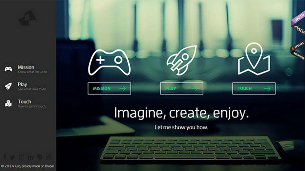
Luvo, a healthy food and lifestyle company, uses line icons and ghost
buttons to enrich the design of their whole site. The color palette
permeates through the entire visual; resulting in a refined appearance.
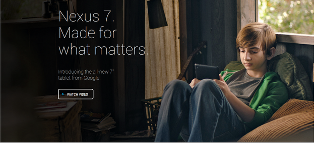
Nexus 7,
the tablet from Google, uses ghost buttons to allow for an uninterrupted
image of the product in use. This sleek design takes the focus away
from the text, and focuses on the product.

No Header Background Image
In past years, brands have had an affinity for large, customized
photography in campaign areas. Images appeared at maximum width and ran
to the edge of the browser/page, just like in magazines. Those
print-based design elements are still a part of Web design trends, but
we predict you’ll see less imagery and simpler campaign areas. This
allows for typography to stand out and removes any visual
distractions—straight to the content!
Dress Responsively’s campaign area features just type. No imagery here, so you can appreciate the retro typography on its own.

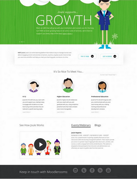
The
Moodlerooms website
focuses on the bright color and bold typography that greets consumers
which are critical elements of the brand’s personality. Their site
design also employs a fun play on line icons to keep with the character
style of brand imagery. This combination of techniques helps draw site
visitors straight to the content.

Material Design
This Web design trend is a maturation of flat design—a popular
technique in User Interface design that focuses on clean, minimal use of
color, shapes and typography.
 Developed by Google
,
material design combines the principles of flat design with slight
animation and gradients to present elements from the 3D world. Google
describes “material” as “grounded in tactile reality, inspired by the
study of paper and ink, yet technologically advanced and open to
imagination and magic.” We’ll see more of this as simplicity and user
experience becomes better integrated in desktop and mobile experiences.
In fact, there are many instances of material design in Google’s
updated OS, such as the address bar doubling as a progress bar to
enhance the user experience and simplify the mobile layout.
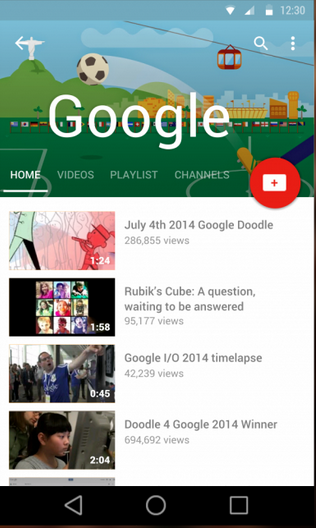
Google masters their own material design in a unified, yet playful approach to their YouTube Android display.
 Microinteractions
Good user experience and Web design is all in the details, and
today’s users are more inclined to notice the subtle interactions in a
website. Small animations engage users and make the content more
interesting. Not only can animations be fun, but they are becoming more
meaningful and informative. Motion is also being used in material design
to transition between states and to focus users’ attention.
LinkedIn brings in subtle interactions we often find in mobile
experiences. Hovering over the content area reveals a “Skip” button
giving the user additional options. The animation also creates focus for
the user.
Amazon uses
mircointeractions to engage consumers while they are checking out, and
encouraging them to subscribe to their Prime account in order to save on
their current order.
 Interactive Infographics
Infographics were extremely popular in 2014, and now they’re
continuing to get even better. Joining web interactivity and data makes
everything more fun. Users have a more engaging experience and the
interactivity allows for better storytelling. Instead of static images,
users can navigate through the infographic like a website and reveal
data “Easter eggs.”
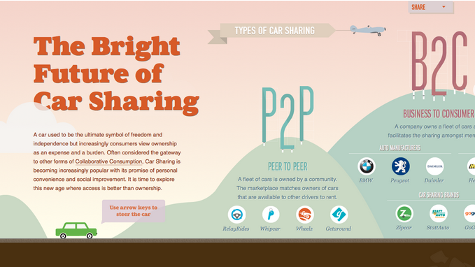
Browsing through the
Future of Car Sharing infographic reveals
lots of goodies. The horizontal scrolling supports the timeline aspect,
while the interactivity keeps the visitor engaged.
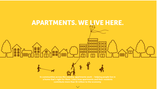
 Apartments: We live here
uses an interactive infographic to engage the consumer and draw their
attention to their product offering. In this example, the interactive
design shows a community with its residents engaging in normal behavior
such as walking, flying a kite, and walking the dog. This gives off the
impression that they will help you find the right apartment.

Full Screen Video
While minimalism continues to be hot and new, full screen backgrounds
and videos continue to dominate the other end of the spectrum. A recent
study from MIT stated that in as
little as 13 milliseconds people can process and retain visual images,
meaning that a quick hook is all it takes.

A major campaign in the launching of the Apple Watch features screen
filling looping images paired with minimal text. Advances in HTML5 are
enabling brands to use videos in a way that wasn’t previously possible.
As trends continue to mature and become more sophisticated, it will
be interesting to see how designers interpret them. Elements from the
past will continue to integrate themselves into future aesthetic and
principles—only time will tell if we begin to see complete departures
from past design movements, or if these trends continue to evolve.
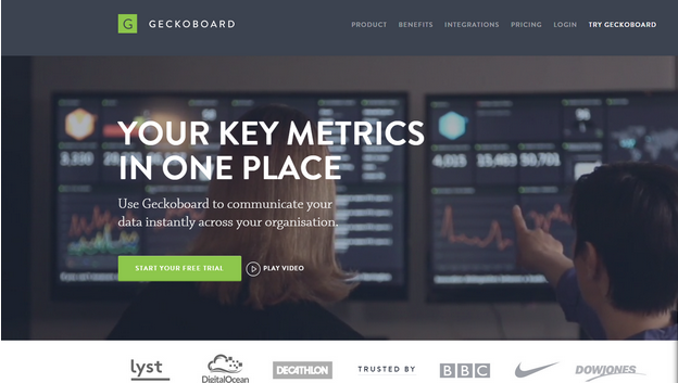
Geckoboard immerses site
visitors immediately with the content through a full screen video on
their homepage. It leaves no doubt that video connects users to the
brand in ways that a still image cannot.