Image AD

Staff Pick

Apps

Gadgets

News

Designs

How to convert mobile visitors into customers


Born with smartphones in our hands, nowadays everything we do in our life surrounds these devices. From waking up in the morning and checking our phones (before even brushing our teeth) to navigation, communication and of course shopping.


In order to convert these mobile users into actual customers, it’s imperative that we truly understand our customers on an emotional level, identify their emotional triggers and translate that knowledge into a better product for them. This is the true formula for converting mobile visitors into customers.

Mobile isn’t the next big thing, it already is.

Just last May Google announced for the first time ever that mobile search has surpassed desktop. This is is a huge change in the way people consume content, search and buy. If that’s not big enough evidence, research by Statista shows that by 2019, mobile traffic to websites will increase by 480 percent.
Unfortunately while mobile search and traffic keeps rising, (mobiles contribute 50.3 percent of all ecommerce traffic) conversions are extremely low, to non-existing. A research by Monetate shows a whopping 240 percent gap between conversion on desktop and mobile. This may be due to the fact that four in five consumers experience problems conducting transactions on mobile devices.
Another critical reason for extremely low conversions on mobile is to do with the vast majority (83 percent) of websites that aren’t optimized for mobile at all (pinch and zoom) and the rest are responsive design websites.
Responsive design means designing a website that looks good whether it is displayed on a desktop monitor or a five-inch screen of a smartphone. The layout is fluid and allows the website to automatically adjust according to the screen of the visitor.
The main reason why developers go for responsive design is because of their overall versatility. The long term maintenance of a responsive site is easier since the code doesn’t need to be tweaked anymore to accommodate different layouts. Added to the fact that Google recently updated their algorithm to favour sites which are mobile friendly, it’s easy to see why most business owners choose responsive design.
Unfortunately, what responsive design really means is taking an entire desktop experience and cramming it into a mobile one. Forcing a desktop experience, on a mobile user. Doing this, is extremely problematic.
Research shows, that while using smartphones we also spend 57 percent of our time using other devices at the same time! We do not use smartphones the same way we use desktop. We use each device differently and each device has it’s own purpose. Assuming that people will shop the same way on both devices leads to a HUGE loss in revenue.

Understanding your mobile visitors

As Herbert Simon once said, “A wealth of information creates a poverty of attention”. When we’re on our mobile phones we’re on the go and usually multitasking; everything happens in real time and we have absolutely no patience. Furthermore, 80% of mobile users still say they feel unsafe checking out on mobile.
If your site doesn’t load fast enough or requires users to scroll across multiple pages, these users will happily leave your page and skip across to your competitor. In other words, mobile users require a different user experience which allows them to find what they want on your site with minimum effort and time. Websites who have noticed this and have created a separate mobile experience have seen large increases in revenue.

Yahoo launches Livetext messaging app


Yahoo just took the lid off its new audioless livestreaming app, Livetext. The idea is similar to what Skype would be if your Skype was muted and you can see chat texts overlaid atop the video stream.
During Yahoo’s announcement, many of us in the TNW virtual newsroom were skeptical. With Periscope, Meerkat, Facebook Messenger, Snapchat, Vine and Skype already crowding the market, it seemed odd that Yahoo decided to create yet another an app for the internet generation who are used to the noiseless world of GIFs.
Really, go ask the next teen you find and see if they know what Yahoo is.

I get the idea of Livetext. There are many times where having calls just isn’t convenient, or people just don’t feel like speaking out loud. It’s why apps like Seamless and the basic premise of texting work so well.
But if Livetext is meant for you to be natural, uninterrupted and covert with your video livestreams, pray tell who would want to watch me text my friends from virtually the worst angle ever.

“People understand expressions better,” Yahoo says during the announcement. “You don’t have to use LOLs or OMGs with video.” If anything, Livetext will prove to your friends you are not actually LOL-ing when you sent that
 emoji.
During the demo, you can also see Livetext’s senior product management director Arjun Sethi fumbling to text properly without making typos. Maybe it’s a simple case of stage fright, but this much holds true: It just feels unnatural. There’s nothing sexy about watching someone text from under their chin, but watching them move and emote while looking at the camera might be. Why would you want to try to do both simultaneously?
We already have a problem with walking and texting at the same time. Now we have to worry about potentially walking, texting and livestreaming all at once.
The fact is, we like GIFs because they’re often better at expressing our thoughts than our faces. Also, GIFs don’t have unflattering angles. And on the Web, all we ever want is to put ourselves in the best light.
The premise of Livetext might work well if it was incorporated as part of Yahoo’s Tumblr blogging scheme. I can see this possibly working in-line on a user’s Tumblr stream, and it would better target the correct demographic.
At best, it would be ideal for the deaf community or those in emergency situations (i.e. kidnapping, domestic violence) where audio cannot be used. It’s potentially quite useful, but the marketing on it seems off. Yahoo’s got the right idea in mind, but it seems to be unsure of what to do with the concept.

6 design trends taking over the Web


We’re already halfway through 2015, and in the last few months we’ve seen many trends come and go. What has not gone, however, is the deliberate movement to get back to the basics without unnecessary features.
The days of cluttered pages overflowing with information have passed, and they’re being replaced by an increased focus on simplicity and user interface. So in honor of getting back to the basics, here’s a rundown of the six increasingly hottest trends we know you’ll keep seeing in months to come:
Line Icons and Ghost Buttons
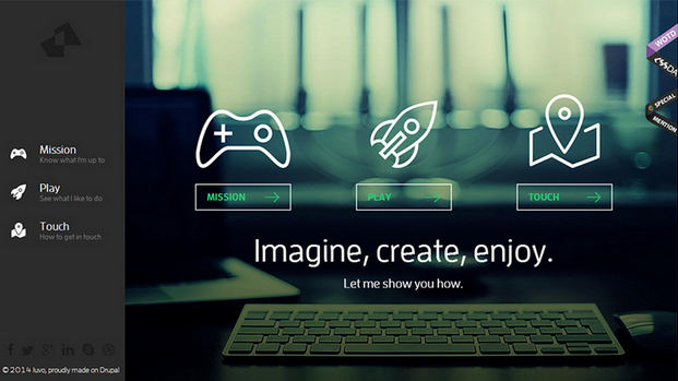
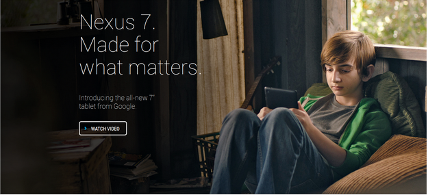
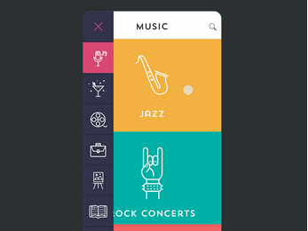
With the introduction of Apple’s iOS 7, we have seen a popular rise in line iconography and ghost buttons—transparent buttons outlined with a thin line. These techniques create a simpler aesthetic by allowing icons and buttons to appear lighter and act as support to larger and more colorful photography or illustrations. They also have become integral to the flat interface style that has grown popular in the past few years.
Screen Shot 2015-07-24 at 14.49.38
Luvo, a healthy food and lifestyle company, uses line icons and ghost buttons to enrich the design of their whole site. The color palette permeates through the entire visual; resulting in a refined appearance.
Nexus 7, the tablet from Google, uses ghost buttons to allow for an uninterrupted image of the product in use. This sleek design takes the focus away from the text, and focuses on the product.
Screen Shot 2015-07-24 at 14.50.30

No Header Background Image

In past years, brands have had an affinity for large, customized photography in campaign areas. Images appeared at maximum width and ran to the edge of the browser/page, just like in magazines. Those print-based design elements are still a part of Web design trends, but we predict you’ll see less imagery and simpler campaign areas. This allows for typography to stand out and removes any visual distractions—straight to the content!
Dress Responsively’s campaign area features just type. No imagery here, so you can appreciate the retro typography on its own.
Screen Shot 2015-07-24 at 14.51.32
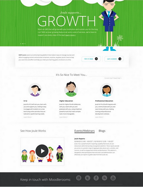
The Moodlerooms website focuses on the bright color and bold typography that greets consumers which are critical elements of the brand’s personality. Their site design also employs a fun play on line icons to keep with the character style of brand imagery. This combination of techniques helps draw site visitors straight to the content.
Screen Shot 2015-07-24 at 14.52.23

Material Design

This Web design trend is a maturation of flat design—a popular technique in User Interface design that focuses on clean, minimal use of color, shapes and typography.
Screen Shot 2015-07-24 at 14.52.57
Developed by Google, material design combines the principles of flat design with slight animation and gradients to present elements from the 3D world. Google describes “material” as “grounded in tactile reality, inspired by the study of paper and ink, yet technologically advanced and open to imagination and magic.” We’ll see more of this as simplicity and user experience becomes better integrated in desktop and mobile experiences.
In fact, there are many instances of material design in Google’s updated OS, such as the address bar doubling as a progress bar to enhance the user experience and simplify the mobile layout.
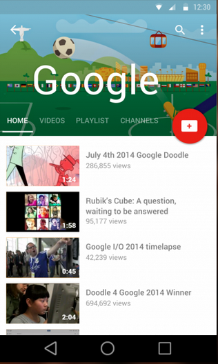
Google masters their own material design in a unified, yet playful approach to their YouTube Android display.
Screen Shot 2015-07-24 at 14.54.40
Microinteractions
Good user experience and Web design is all in the details, and today’s users are more inclined to notice the subtle interactions in a website. Small animations engage users and make the content more interesting. Not only can animations be fun, but they are becoming more meaningful and informative. Motion is also being used in material design to transition between states and to focus users’ attention.

LinkedIn brings in subtle interactions we often find in mobile experiences. Hovering over the content area reveals a “Skip” button giving the user additional options. The animation also creates focus for the user.
Amazon uses mircointeractions to engage consumers while they are checking out, and encouraging them to subscribe to their Prime account in order to save on their current order.
Screen Shot 2015-07-24 at 14.56.52
Interactive Infographics
Infographics were extremely popular in 2014, and now they’re continuing to get even better. Joining web interactivity and data makes everything more fun. Users have a more engaging experience and the interactivity allows for better storytelling. Instead of static images, users can navigate through the infographic like a website and reveal data “Easter eggs.”
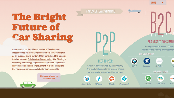
Browsing through the Future of Car Sharing infographic reveals lots of goodies. The horizontal scrolling supports the timeline aspect, while the interactivity keeps the visitor engaged.
Screen Shot 2015-07-24 at 14.57.58
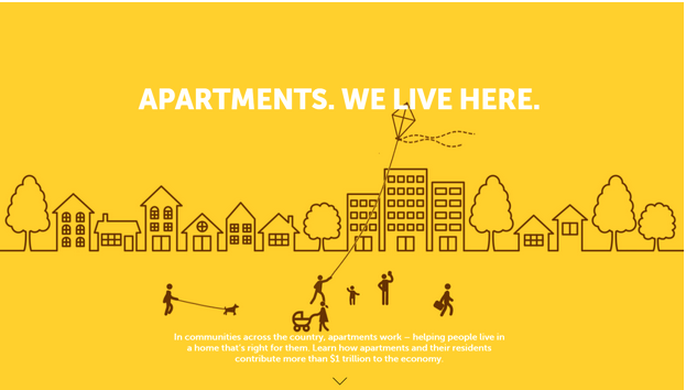
Apartments: We live here uses an interactive infographic to engage the consumer and draw their attention to their product offering. In this example, the interactive design shows a community with its residents engaging in normal behavior such as walking, flying a kite, and walking the dog. This gives off the impression that they will help you find the right apartment.
Screen Shot 2015-07-24 at 14.58.28

Full Screen Video

While minimalism continues to be hot and new, full screen backgrounds and videos continue to dominate the other end of the spectrum. A recent study from MIT stated that in as little as 13 milliseconds people can process and retain visual images, meaning that a quick hook is all it takes.
Screen Shot 2015-07-24 at 14.59.02
A major campaign in the launching of the Apple Watch features screen filling looping images paired with minimal text. Advances in HTML5 are enabling brands to use videos in a way that wasn’t previously possible.
As trends continue to mature and become more sophisticated, it will be interesting to see how designers interpret them. Elements from the past will continue to integrate themselves into future aesthetic and principles—only time will tell if we begin to see complete departures from past design movements, or if these trends continue to evolve.
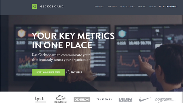
Geckoboard immerses site visitors immediately with the content through a full screen video on their homepage. It leaves no doubt that video connects users to the brand in ways that a still image cannot.
Screen Shot 2015-07-24 at 14.59.37

Here’s why your Twitter app is looking different


There’s a lot of hooplah on Twitter today about… well, Twitter.


The company has just started a series of tests that tweak major changes to its design on iOS, including the replacement of the ‘fav’ button with a heart which we saw on Android last month.
It appears that Twitter is performing a series of A/B tests which revolve around the design of the reply, retweet and favorite buttons found directly below tweets in the timeline.
The first test makes the buttons significantly more prominent than their faded counterparts in the current design (pictured lower left), adding a circle to draw attention.
Old vs New Twitter (new via  Nathan Bashaw)
Old vs New Twitter (old via Mic Wright, new via Nathan Bashaw)
Another test fills in those buttons with a dark color to provide contrast, which looks awful.
Screen Shot 2015-07-28 at 10.15.49 AM
via Andre Plaut
A third test adds the circular border and replaces the favorite button with a heart.
Twitter's new heart icon test
via Daniel Singer
As you may have noticed in the final screenshot, Twitter has also been testing a white variation of its design for the last few weeks.
These button tests are obviously for a single purpose: pumping up engagement on the service. The company has very publicly said it wants to increase engagement across its social network and this is latest way to boost that.
Twitter pushing the new ‘like’ button test to iOS users as well as Android testers indicates that the company is seriously mulling killing the current favorite button.
I actually dig the new buttons — it makes them more obvious and encourages the user to stab them. I suspect the test will be very successful.
What I am worried about, however, is the death of the favorite button. The test expansion to iOS shows the company is seriously considering killing off the star in favor of the ‘like’ heart and I think it’s a bad idea.
Favorites mean hundreds of different emotions and responses  — I’m done talking to you, I saw your message, I hate your message, etc — so simplifying it to a ‘like’ action dumbs it down to Facebook-level reactions. That may simply be because more people understand what the button actually means.
The change seems small enough that it won’t matter, but I think it’ll fundamentally alter the way people use the button. I’d be more interested in seeing the company extending the favorite in new ways, like Slack recently did with ’emoji favorites.’
Twitter, you can change anything you like, but please leave our favorite buttons alone.

OnePlus 2 launches with 5.5″ full HD display


Chinese handset maker OnePlus has finally announced its second flagship handset – the OnePlus 2 – following weeks of drip-feed teaser announcements and leaks.
The follow-up to the popular OnePlus One offers a 5.5-inch 1080p HD display, dual-SIM support, a 5-megapixel front-facing snapper, wide-angle f/2.0 aperture 13-megapixel rear camera with dual LED flash and 64-bit 1.8GHz Octa-core Snapdragon 810 processor. You get the option of up to 4GB of RAM and 64GB of storage too.

Following in other manufacturer’s footsteps – most notably Apple and Samsung – the OnePlus 2 now has a fingerprint scanner, allowing you to quickly wake and unlock the device. The company has said it’s faster than Touch ID, too.
It houses a USB Type-C charging port too, future proofing it somewhat. The company promised to take that a bit further though, and has delivered on that by making the same port Type-A reversible as well – meaning it won’t matter which way in you place the cable.

One of the ways OnePlus looked to make a splash in the market first time around was the pairing of high-end specs at a decidedly mid-range price point. It’s a formula that stays true for the OnePlus 2 too with a starting price of just $329. However, with a competitive marketplace for smartphones, it takes more than pairing specs with value to attract buyers in huge numbers.
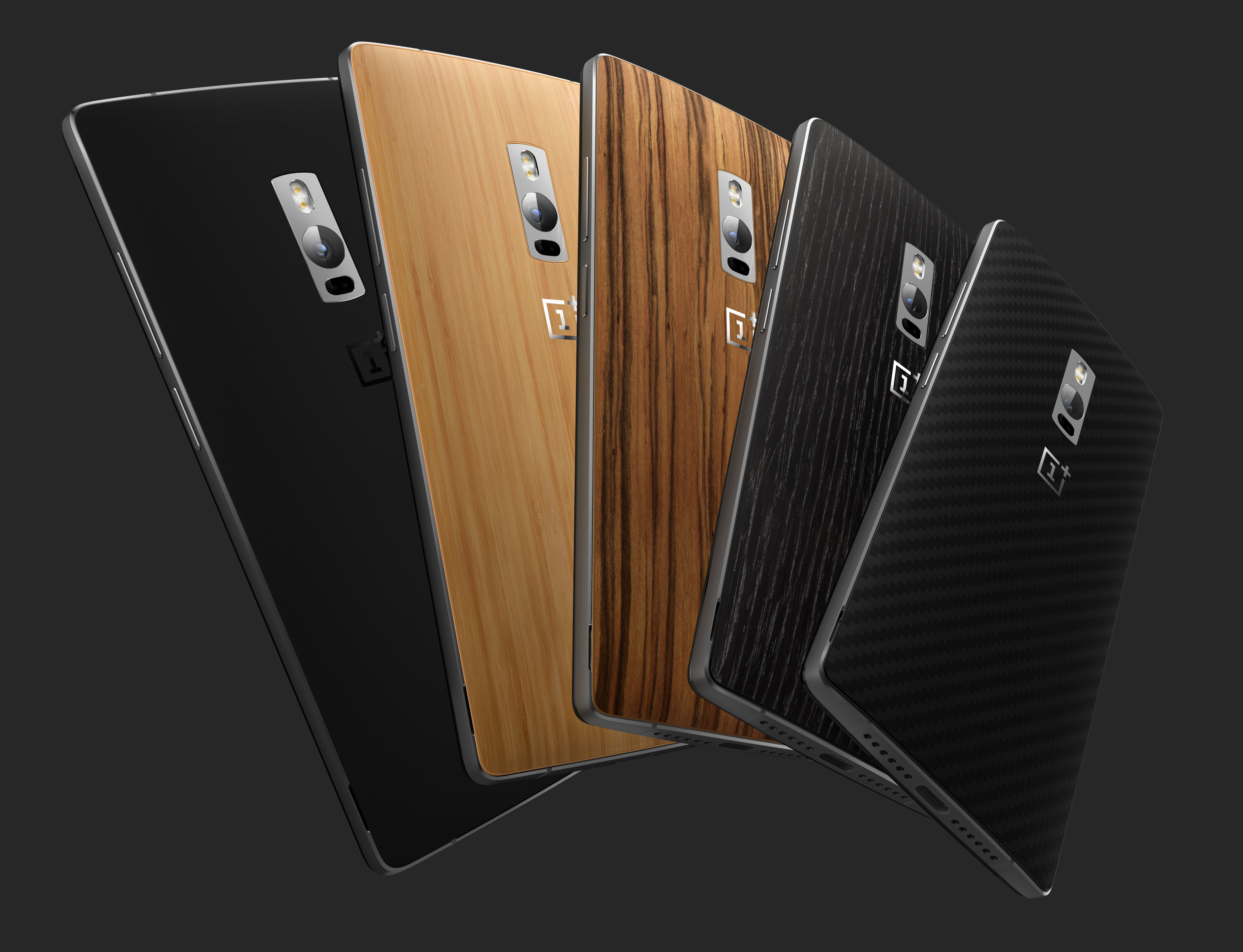
The OnePlus 2’s impressive internals are housed in an aluminium-magnesium alloy frame with stainless steel accents. There are a range of rear covers for the phone too, including bamboo (actual bamboo, not ‘bamboo effect’), ‘Black Apricot (not an actual apricot), rosewood and Kevlar.
OP_s03_c031
The OnePlus 2 is also the company’s first handset to ship with its own Oxygen OS, based on Android 5.1.
The company says the platform is “a refreshing take on the pure Android experience” and allows for “subtle” personalization of the device, like allowing you to switch between using hardware or capacative on-screen buttons.
There are a few custom OxygenOS apps pre-installed in place of regular Android too, like the Camera, Audio Tuner and File Manager.
As was the
irritating case first time around, you’re going to need an invite to buy a OnePlus 2.
In the US and Europe, sales will start (provided you have that invite) on August 11 with the 64GB priced at $389. The slightly lower specced model with 16GB of storage and 3GB of RAM will be available “later” priced at $329, OnePlus says.